Using gganimate to map NEET patterns in England
I have been playing around with the newly revamped gganimate package recently. I’ve found it so intuitive, especially having used d3 before. You can really make some amazing graphs by utilising only a few lines of extra code.
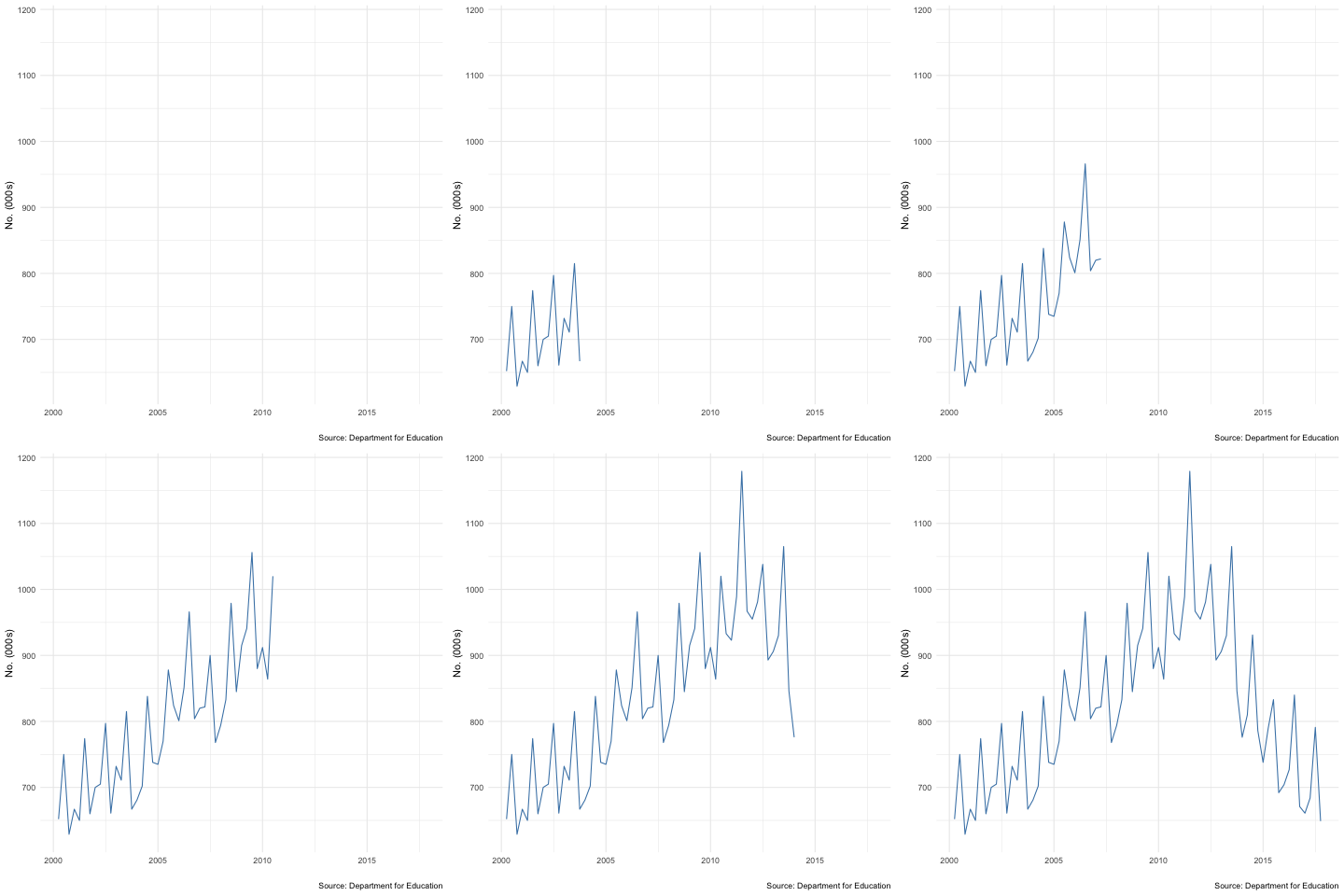
For example: below is the full code (including cleaning/transformation) I used to create a gif of the numbers of young people in England aged 16-24 who were not in employment, education or training (NEET) between 2000 and 2017. I made use of the new gganimate function transition_reveal, which allowed me to slowly transition the geom_line along the Date variable.
library(readxl)
library(tidyverse)
library(gganimate)
library(rehsape2)

##Read in the data

mydata <- read_xls("~/Downloads/neets-borough-region.xls", sheet=3)

##Rename/reshape the data properly

mydata <- mydata[1:11, ]
mydata[1,1] <- "Region"
colnames(mydata) <- mydata[1, ]
mydata <- mydata[2:11, ]

##Reshape - wide to long
##Change Q1:4 to dates

mydata <- mydata %>%
  reshape2:: melt(id.vars="Region") %>%
  mutate(Year = str_sub(variable, 1, 4)) %>%
  mutate(Date = case_when(
    str_detect(variable, "Q1") ~ paste0("01/01/",Year),
    str_detect(variable, "Q2")  ~ paste0("01/04/",Year),
    str_detect(variable, "Q3") ~ paste0("01/07/",Year),
    str_detect(variable,"Q4") ~ paste0("01/10/",Year),
    TRUE ~ "0")) %>%
  select(-Year, -variable) %>%
  mutate(Date = as.Date(Date, format="%d/%m/%Y")) %>%
  mutate(value = as.numeric(value)) %>%
  filter(Region=="England") %>%
  mutate(value = value/1000)

##Plot

ggplot(mydata, aes(x=Date, y=value, group=1)) +
  geom_line(color="steelblue") +
  theme_minimal() +
  transition_reveal(Date, along=Date) +
  xlab("") +
  ylab("No. (000s)") +
  labs(caption = "Source: Department for Education")
Only 1 extra line of code! And the finished product:
