Bridget Suthersan

Data Scientist working in the not-for-profit sector.
Advanced data analytics and visualisation
View My LinkedIn Profile
The Office has long been one of my favourite TV shows (and I’m one of those terrible people who love both the UK and US versions, equally). Which is why I was so excited when I saw the release of the Schrute package on CRAN recently. This package includes all of the script data for The US version of the Office, as well as information about the episode, season, and director.
```{r, echo=FALSE} library(schrute) library(tidytext) library(tidyverse) library(knitr) mydata <- schrute::theoffice mydata_text <- mydata %>% unnest_tokens(word, text) %>% anti_join(stop_words)
To begin with, let's take a look at the breakdown of words by character. For brevity, I've filtered for the top 20 characters by word count.

```{r, echo=FALSE}
mydata_text %>%
  count(character, sort=TRUE) %>%
  top_n(20) %>%
  ggplot(aes(reorder(character, n), n)) +
  geom_bar(stat='identity', fill='steel blue') +
  coord_flip() +
  theme_minimal() +
  xlab("") +
  ylab("Number of words") +
  ggthemes::theme_fivethirtyeight()
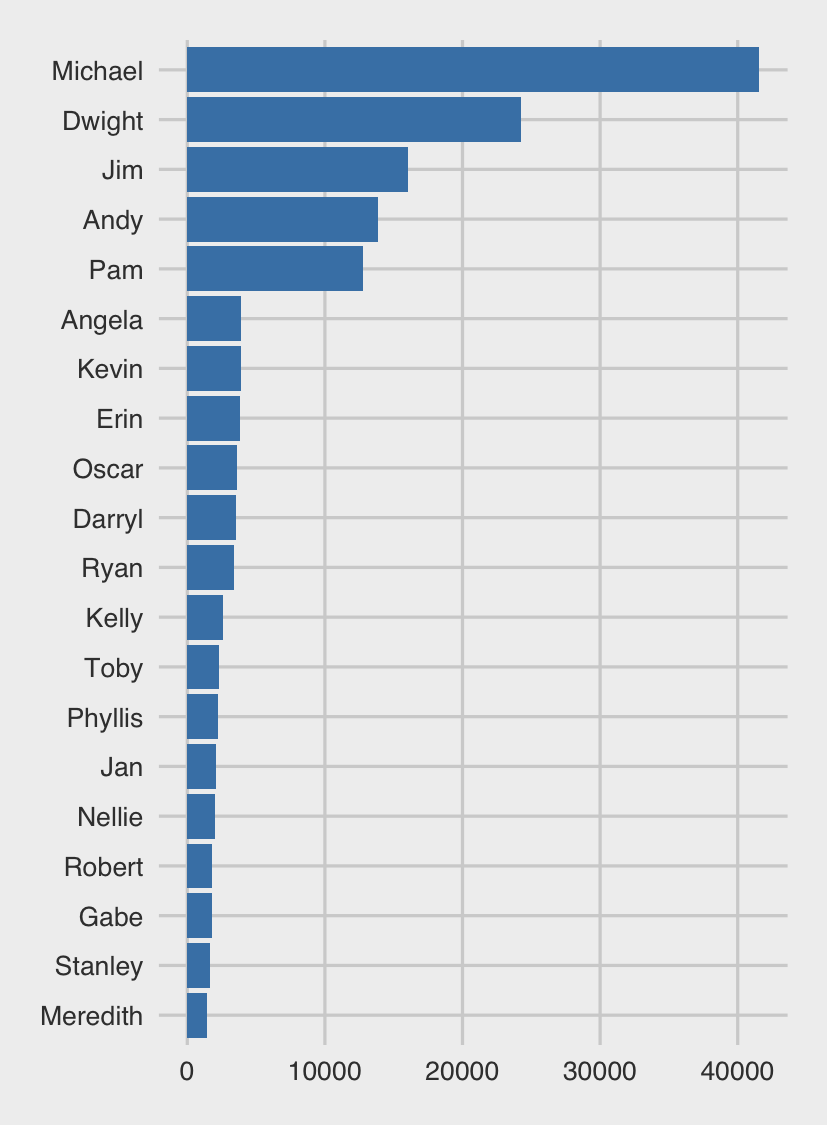
There are probably no real surprises for any Office fans here. Michael was basically the lead for majority of the seven seasons; he received a lot more to-camera monologues than anyone else. We also have a very clear deliniation between Michael, the immediate supporting cast (Dwight, Jim, Andy and Pam), and the rest of the cast of characters (Angela through to Meredith).
What about season? Andy didn’t appear until about Season 3, but he still has more overall words than Pam, who was one of the originals. This made me think, do word count breakdowns change over seasons?
top20 <- mydata_text %>%
  count(character, sort=TRUE) %>%
  top_n(20)

mydata_text %>%
  group_by(character, season)  %>%
  count() %>%
  filter(character %in% top20$character) %>%
  ggplot(aes(reorder(character, n), n)) +
  geom_bar(stat='identity', fill='steel blue') +
  coord_flip() +
  theme_minimal() +
  xlab("") +
  ylab("Number of words") +
  ggthemes::theme_fivethirtyeight() +
  facet_wrap(~season)
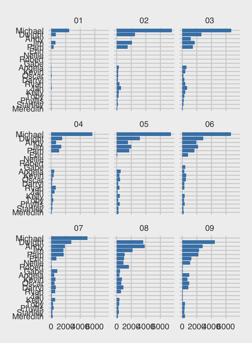
Michael, this chart shows, has always dominated the word count. Seasons 2 and 4 stand out in particular in this regard. What is interesting, though, is what is happening with primary and secondary supporting casts. For the primary supporting cast (Dwight, Jim, Andy and Pam), there a clear jump between seasons 2-4, and seasons 5 onwards, where they all start to get more words. Season 7, meanwhile, starts seeing the word count of the secondary supporting cast start to climb. This is easier to see if we group the characters.
primary <- c("Jim","Pam","Dwight","Andy")
character_data <- mydata_text %>%
  group_by(character, season)  %>%
  count() %>%
  filter(character %in% top20$character) %>%
  mutate(Character_Type = case_when(
    character=="Michael" ~ "Michael",
    character %in% primary ~ "Primary",
    TRUE ~ "Secondary"))

character_data %>%
  group_by(Character_Type, season) %>%
  summarise(Total_Words = sum(n)) %>%
  ggplot(aes(season, Total_Words, fill=Character_Type)) +
  geom_col() +
  ggthemes::theme_fivethirtyeight() +
  theme(legend.title = element_blank())
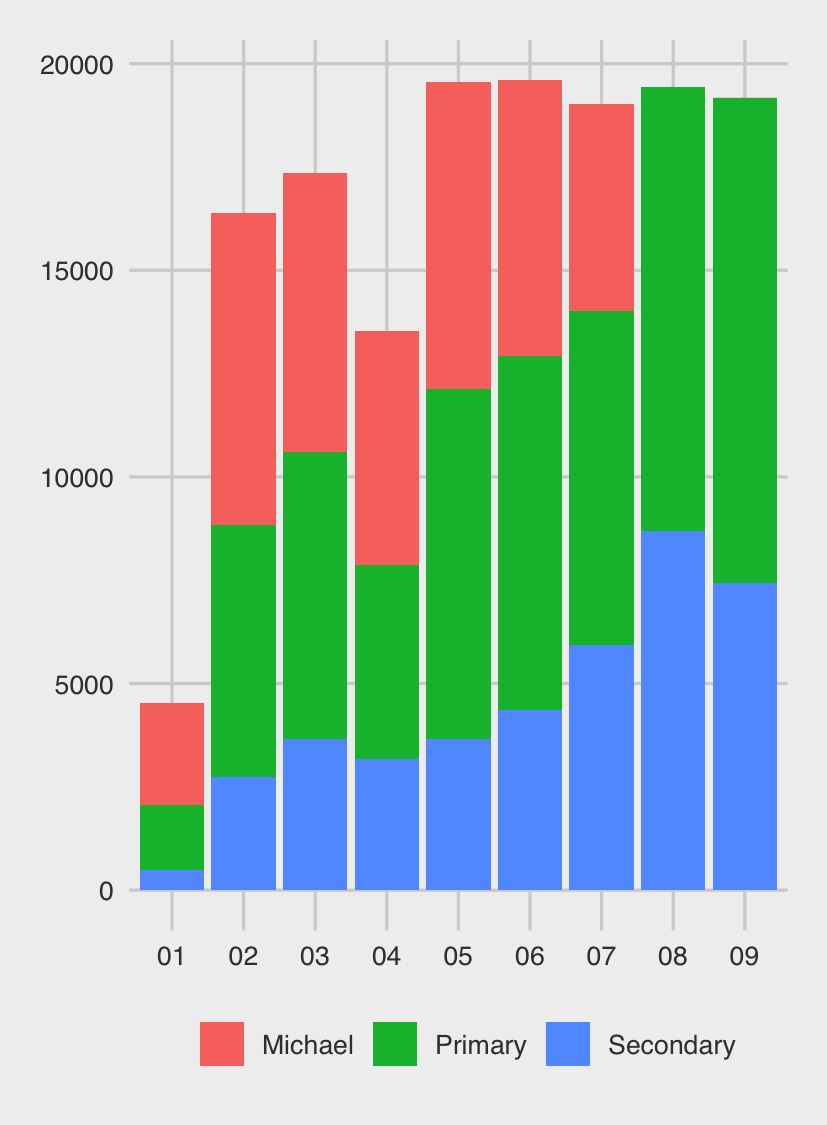
From Season 4, we start to see the word counts of both the primary and secondary characters increasing steadily; Michael’s falls (and of course, doesn’t exist in Seasons 8 and 9, after Steve Carrell had left the show).
So what other differences can we draw from the characters? A cool feature of the tidytext package is the ability to analyse words by sentiment. Let’s take a look at our top five characters to see if they differ by different sentiments expressed.
characters <- c("Michael","Pam","Dwight","Jim","Andy")
nrc <- get_sentiments("nrc")
mydata_text %>%
  inner_join(nrc) %>%
  filter(character %in% characters) %>%
  group_by(character, sentiment) %>%
  count() %>%
  ungroup() %>%
  group_by(character) %>%
  mutate(Percentage = n/sum(n)) %>%
  ggplot(aes(character, Percentage, fill=character)) +
  geom_col() +
  facet_wrap(~sentiment) +
  coord_flip() +
  ggthemes::theme_fivethirtyeight() +
  theme(legend.position = "none")
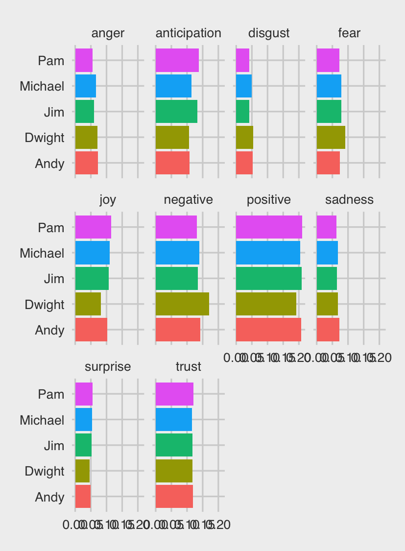
For fans of the show, it might be expected that Dwight would score high on negativity, fear, anger and disgust, and lower on positivity, joy and trust - but that isn’t actually the case. Indeed, looking at the plot, there doesn’t seem to be much of a difference between the characters at all.
Another tool from the tidytext package that might help us differentiate between characters, however, is term frequency-inverse document frequency, or tf-idf. The tf-idf algorthm works by looking for words which occur more frequently within a particular grouping variable (in this case, characters, but we could also examine by season or episode), but relatively rarely when compared to the rest of the data. For example, if we were looking at terms instead of words, we would expect ‘that’s what she said’ to be rated highly for Michael.
characters <- c("Michael","Pam","Dwight","Jim","Andy")
mydata_text %>%
  filter(character %in% characters) %>%
  anti_join(stop_words, by = "word") %>%
  count(word, character) %>%
  bind_tf_idf(word, character, n) %>%
  arrange(desc(tf_idf)) %>%
  mutate(word = factor(word, levels = rev(unique(word)))) %>%
  group_by(character) %>%
  top_n(10) %>%
  ungroup() %>%
  ggplot(aes(word, tf_idf, fill = character)) +
  geom_col(show.legend = FALSE) +
  labs(x = NULL, y = "tf-idf") +
  facet_wrap(~character, ncol = 2, scales = "free") +
  coord_flip() +
  ggthemes::theme_fivethirtyeight()
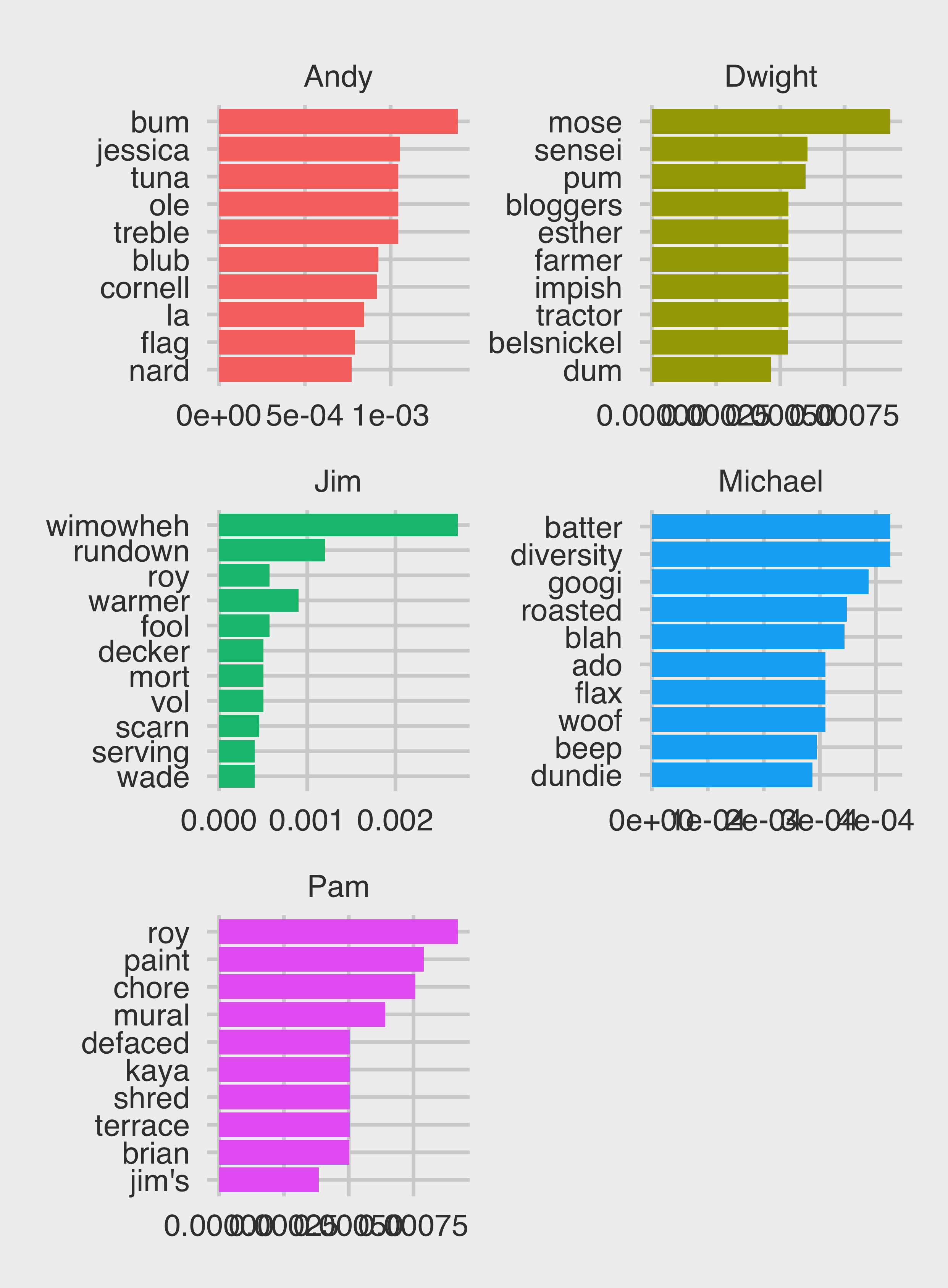
Ah, much better! (Also, does anyone else not need the labels?)
There is a lot more that you could do with the Shchrute and tidytext packages, like:
- Looking at common themes or words by pairs of characters (e.g. Jim/Pam, Michael/Dwight);
- Analysing change in character sentiments over seasons (e.g., did Dwight mellow as The Office went on?)
- Looking the frequency of catch phrases across seasons or episodes (e.g “That’s what she said”,”Beets”, etc.)